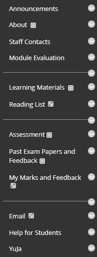
The content menu on the left-hand side of your Backboard course is the primary navigation tool for your students. Having a simple and intuitive content menu sets the tone for your students’ experience when navigating your Blackboard module.
Curating a module structure
Use menu headings to organise the module content and activity logically.
- Keep the menu titles short or to a single word
- Limit the number of menu headings
Your menu should reflect the structure of your course and complement the organisation of your folders and content.
The menu should be used for general headings, and a clear and contextualised folder structure should be used within content areas to divide topics for your learners.
Each menu item should be distinct and obvious. Students should be able to understand the difference between each content area and what information or materials will be inside without clicking on them.
Headers & Dividers
You can complement the folder structure of your module further by using headers and dividers to organise your menu into sections.
As with the module as a whole, try to avoid having too many headings and ensure that dividers make meaningful breaks between sections, rather than between each menu item. A well-organised content menu should not need headers at all and it should be noted that headers can look like broken links to a first-time visitor to a module.
Automatic menu items
Your menu has several automatically created areas that should not be edited, including two which are necessary for T&L Technologies integration:
- Assessment – assignments created in RISIS appear here.
- YuJa – a link to your module’s Channel and further links to support materials are located here.
Avoid creating menu items that have similar names to these, such as “Assessment Information”, and instead use these pre-made areas for similar content.
Do not rename these areas, as it could cause issues with integration between Blackboard, RISIS and Stream.


