When we create digital materials, there is potential to indirectly discriminate against students who rely on assistive technologies to interact with documents and presentations.
Ensuring that learning materials and resources are accessible creates an environment of proactive inclusion, by reducing the need for individual adjustment, and allowing tools like Blackboard Ally to generate effective alternative formats, benefiting all learners by diversifying their approaches to module material.
For information on how to ensure your live sessions are accessible, please see our page on accessible webinars. We have also created a set of student accessibility personas, to help you better understand the challenges and needs of students with a range of conditions.
Designing Accessibly
Designing accessibly can feel daunting at first, but by using accessible templates or accessibility checkers, you can save time and make accessible design part of your creation process. The tools available to University staff, such as Blackboard Ally and the Microsoft Accessibility Checker, can make material creation and retroactive fixing of documents a less time-consuming process.
These tools apply principles that can improve the experience of all users when accessing documents, however there is no magic fix that will make your resources perfectly accessible to everyone who interacts with them. The guidance on this page will give you basics to consider when designing accessibly, which will benefit the majority of students and especially those with a specific need, and help to foster proactive inclusion in your teaching.
S.C.U.L.P.T
S.C.U.L.P.T for Accessibility was developed by Worcestershire County Council and provides a handy acronym for remembering 6 principles for designing accessible learning materials. You can find out more about S.C.U.L.P.T on Ability Net.
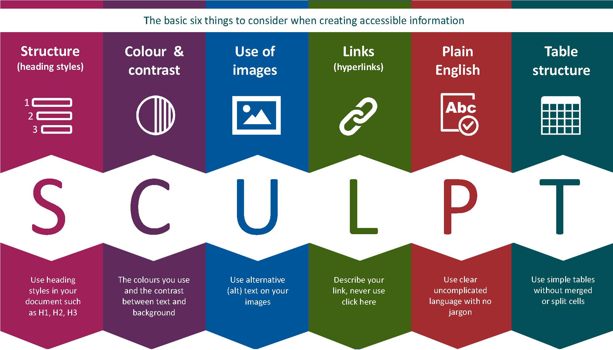
The six principles for S.C.U.L.P.T are:
Structure
Structure is the way content within documents is organised.
When we engage with documents, especially long ones, we rarely read in their entirety. A clear structure, with headings and subheadings, helps readers to quickly find important sections and to work through the document in a way that is logical and manageable.
Structure in a document is especially helpful for students who rely on screenreaders or keyboard navigation, as it allows them to move quickly through sections to find content that is relevant, without having to read the entirety of the text.
Colour and Contrast
Poor use of colour or insufficient contrast can have an effect on everyone who access digital content, depending on their current situation or specific need.
Colours on a screen can seem less vibrant in bright light, or sunshine.
Contrast and resolution can vary greatly between screen and projectors.
Ensure that colour is not your only means of conveying information.
Sufficient contrast and choice of colour is especially helpful for students who are blind or have low vision, or are colourblind. Poor contrast also forces the eyes to work harder, which can lead to strain and headaches and increases the effort for readers when interacting with content.
Be aware that high contrast images or colours may not be suitable for all students' needs. Students with ASD (Autism Spectrum Disorders) and ADHD can be overstimulated by high contrast and bright colours.
Microsoft Office accessibility checkers and Blackboard Ally will both help you identify poor contrast in your documents, but you can also check contrast yourself using an online contrast checker.
Use of Images
Images can be a great way to enhance or clarify information for many users, however they are can also create the potential for exclusion for users who are unable to view them or rely on text versions of visual content.
- Never replace text with an image - some images may illustrate a complex system or cycle well, but there should always be some form of text to describe the process or content.
- Use of image should support text - your use of images can be used to illustrate and clarify points from the content of your text, which can aid understanding
- Always use alt-text on your images - alt text provides a description of the content of an image for people who are unable to see it. Screen readers will read out the alt-text as part of a document.
Students who are blind or partially sighted will be unable to interact with content that is entirely visual, and there are a variety of other situations that might mean that someone interacting with a document requires a text version of an image. Tools like Blackboard Ally can produce audio versions of documents, which promotes diverse approaches to learning for your students.
Links
Links can be excellent for signposting, by providing easy navigation to further reading and referencing concepts in documents and webpages.
Links should always be clear, distinct, and descriptive:
- many people who rely on screenreaders access links from documents or webpages in separate tabs, where all of the links from a document are compiled into a list.
- Links should never be "click here", they should always provide context around the destination.
- Links should never be a full web address, "https://sites.reading.ac.uk/tel" would be read out as "https colon forward slash forward slash sites dot reading dot ac dot uk forward slash tel"
Providing clear, descriptive links not only helps users with screenreaders, it also makes documents easier to scan for information and allows you to contextualise links more appropriately.
Plain English
When creating content, you should always have the reader in mind. Using plain English means writing in a way that is clear and concise and avoids unnecessary jargon or unexplained acronyms. Writing plainly for academia can feel like a challenge, but creating clear context for new terms and keeping sentences short and to the point can aid understanding and reduce cognitive load.
Using plain English is especially helpful for students with ASD and non-native English speakers, but also can greatly reduce the amount of text on a page, which can reduce anxiety and prevent students from feeling overwhelmed.
Tables
Tables can be a great way to display information, but can present challenges for blind or partially sighted students and those who rely on screen readers or keyboard navigation.
When using tables, always consider:
- Always define a column header - screen readers use header information to identify columns and rows
- Never split or merge cells - screen readers cannot properly interact with split or merged cells in tables
- Never use blank cells - some screen reading software may think that a table has ended if it encounters a blank cell
- Never nest tables - a "nested table" is a table that sits within another table. Screen readers will be unable to interact with this
Applying S.C.U.L.P.T: Documents & Presentations
The university requires any presentation material to be made available to students 48 hours in advance of a lecture or live session.
When creating accessible documents in Word or presentations in PowerPoint, you can apply the principles from S.C.U.L.P.T in these areas:
Structure
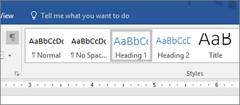
Word:
The Styles function in Word allows you to easily apply headings and subheadings to a document.
PowerPoint
Set a Reading Order on your slides. Reading Order is the order in which the contents of your slide is intended to be read.
This assists users with screen readers and ensures that any alternative formats can be read in a consistent way.
Be aware that Reading Order is set from bottom to top, with the first item to be read at the bottom of the list.
Also consider:
- You choice of font is important, too. Choose a sans-serif font, to aid students with dyslexia.
- If you are not giving students the document in its original format, consider how they will be able to resize the font to suit their needs and whether you choice of font size is appropriate.
Contrast & Colour
Word
When creating documents, consider your use of colour carefully. Many students will have software which allows them to adapt the colour and contrast on a document themselves, but ensuring that any images or graphs have sufficient contrast will benefit everyone who interacts with the material on any device.
If you are using Office 365, Microsoft's Accessibility Checker will highlight any areas with poor contrast in your presentation.
PowerPoint
When creating presentations, be aware that the background colour of your presentation can cause issues for students with dyslexia. An off-white background can make it easier to read text on a slide.
If you are using Office 365, Microsoft's Accessibility Checker will highlight any areas with poor contrast in your presentation.
Accessible templates have been designed by the Design and Print Studio (DPS) for use by university staff.
Use of images
If your presentation or document contains images, then you must add alt-text (or mark them as decorative if they do not contain information) to make them accessible and to enable interaction from all of your students.
If your subject is highly visual and contains presentations with a large amount of images, consider how a text alternative might be provided and what role those images are playing in your teaching. If, for instance, they are all examples of a particular style, then providing additional text around the use of that style in a separate document may be appropriate. You may wish to consider other ways in which the material can be presented.

The UKAAF gives some excellent examples of how to add alt text for complex images or equations.
Links
If your presentation or document contains links, ensure that they are properly described and screentipped and that colour is not the only way of delineating them from other text on a page or slide.
Plain English
Keep sentences short and to the point. This will reduce cognitive load and aid transmission of information.
In PowerPoint, do not overload your slides with information. Use Notes to contain further information, for students to have context for the main points on your slides.
Tables
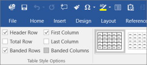
If your presentation or document contains tables, then ensure that you have labelled your Header Rows. Office 365 should do this automatically.
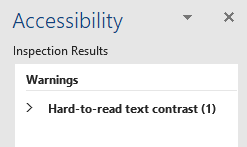
Microsoft Accessibility Checker
Microsoft has its own Accessibility Checker, which is available in all Office programmes from 2010 onwards.
Upgrading to Office 365 will prompt you to check accessibility at the bottom of the page and add the accessibility checker to the ribbon.
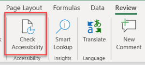
The checker highlights any issues in a file and provides guidance on how to fix it and why it is important.
Accessible Screencasts
Creating accessible screencast content can seem daunting. The guidance on this page and on our page on accessible Screencasts will help you to create screencast content that is accessible as possible.
To make your screencasts as accessible as possible, they must be uploaded to MS Stream, before they are added to your module on Blackboard or shared with students.
Student Accessibility Personas
Drawing on the work of Government Digital Services, we have compiled a set of University of Reading Student Accessibility Personas. These profiles build a picture of seven students of various ages, backgrounds and disciplines, each with a condition or disability which affects their studies. There are details about the students’ conditions, their challenges, hopes and goals, as well as the technologies they use. Each persona contains a set of practical strategies for supporting online and face to face teaching and learning.
