Mobile Device
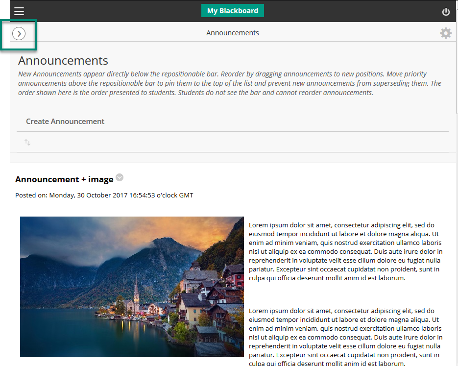
When you go into a Blackboard course on a mobile device, the layout will be slightly different as it is optimised for touch.
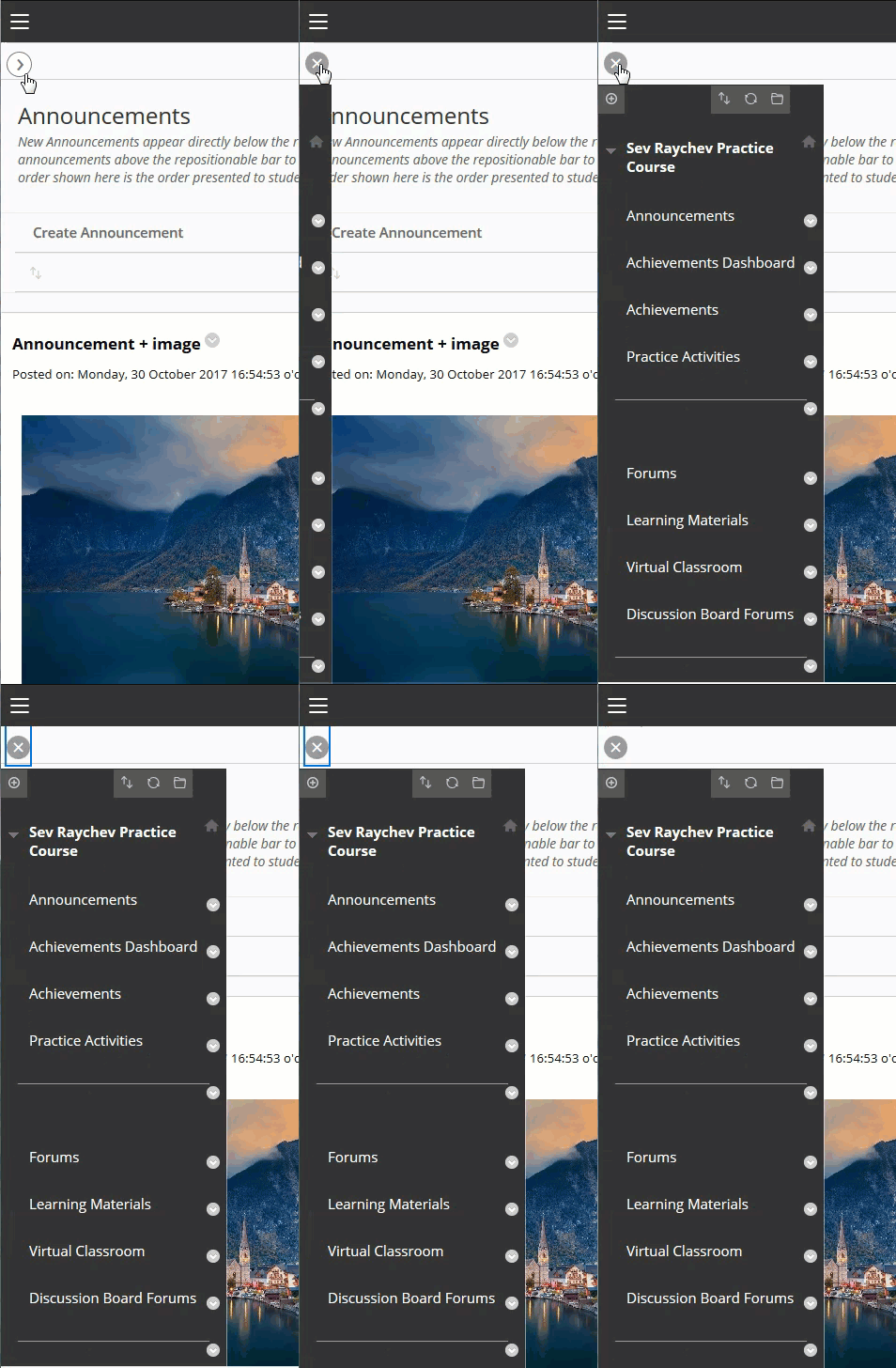
To reveal the menu, click on the arrow in the top left to expand the menu in this view.

Watch this short example.

Desktop or Laptop
If you are on a desktop but with a small screen the menu might also hide, but without going into responsive view.
To reveal the menu in this view, click on the blue bar on the left.

Watch this short example.

Page last updated on September 28, 2022 by taralehane
You must be logged in to post a comment.