University of Reading scientist, Professor Ed Hawkins, has released the climate stripe graphic for 2020, heralding President Joe Biden’s era of climate action in the US.
Iconic climate change visualisations created at the University of Reading have been updated with newly-released data for 2020, completing the hottest decade ever recorded.
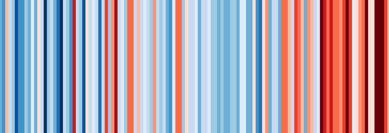
Professor Hawkins, the climate scientist behind the renowned climate stripe graphic, has used newly-released Met Office data to add a stripe representing the average temperature for 2020 to both the global and US versions. The global version shows the stark reality that 2011-2020 was the hottest decade on record, indicated by a continued trend towards deep red, hotter colours.
The updated graphic was made publicly available ahead of President Biden’s inauguration on 20 January, with the Democrat leader having pledged to make climate action one of the top priorities of his administration.
The shareable graphics allow people and organisations worldwide to show their support for action on climate change and build global momentum at this crucial time.
Professor Hawkins, Professor of Climate Science at the University of Reading, said: “The new ruby red stripe representing 2020 is a warning that we must act quickly to curb the trend of rising temperatures.
“The renewed commitment to climate policy in the US is very welcome and will be a big step forward in the race to reduce emissions and avoid some of the damaging consequences that will result as the world heats up.”
The climate stripes
The climate stripes represent average annual temperature data going back to 1850 in a simple and engaging way, using shades of blue or red to illustrate years where the temperature was cooler or hotter than the average for the period as a whole.
The graphics were first made available for countries worldwide in the summer of 2019. Their global appeal has seen them shared on social media by millions worldwide, including by US television meteorologists for the Mets Unite movement, the US House Select Committee on the Climate Crisis, and by US senators who wore badges displaying the stripes to President Trump’s State of the Union address in 2019.
Professor Hawkins has also added the 2020 temperature as a new point on his climate spiral animation, which shot to fame when it appeared in the opening ceremony of the 2016 Olympic Games in Rio de Janeiro.
Getting back on track
Reading is planning a multitude of activities throughout 2021 to help increase public understanding of climate science in the lead up to COP26, the annual UN conference being held in Glasgow this November.
Professor Hawkins said: “With the COVID-19 pandemic having sent shockwaves around the world, 2021 must be the year where we get back on track with action on climate change.
“Pioneering work by climate scientists at Reading and globally will provide the expertise required to inform necessary changes.”
As well as updating the familiar climate change visualisations, the University of Reading and Professor Hawkins plan to release a shareable ‘Stars and Climate Stripes’ graphic – combining the famous US national flag with the warming stripes – ahead of the date the US officially re-joins the Paris Agreement.
The Paris Agreement is an international treaty which entered into force in 2016, and requires the countries who have signed it to cut their carbon footprints in order to prevent global temperatures from rising more than 2°C above pre-industrial levels.
The day President Biden was sworn into office, on 20 January, he signed an executive order beginning the process of re-joining the Paris Agreement accord, and this is expected to be confirmed in mid-February.
Find out more about Professor Hawkins or download the climate stripe graphic.