In the lead-up to the 26th UN Climate Change Conference of the Parties (COP26), CONNECTED speaks to Professor Ed Hawkins MBE about his pioneering research, the inspiration behind the infamous climate stripes graphic, and what urgent action we need to take to tackle climate change.
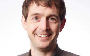 Professor Hawkins is a climate scientist in the National Centre for Atmospheric Science at the University of Reading. His research examines how and why the world’s climate has changed since the industrial revolution – and how it may change over the coming decades – focussing specifically on the interplay between natural climate variations and human-caused trends.
He is also a Lead Author for the Intergovernmental Panel on Climate Change Sixth Assessment Report. This report directly links more recent extreme weather events to climate change, and Professor Hawkins shares his views on whether the science – and the ways we are communicating it – are convincing leaders and the public of the need for urgent action.
“The extreme weather events seen all over the world this summer may help open people’s eyes to the fact that we are already experiencing the consequences of our warming world,” he said.
“But it’s imperative that we continue to communicate that these events will only become more frequent and more intense as the world continues to warm.”
Professor Hawkins also leads Weather Rescue – a citizen science project involving thousands of volunteers – which is recovering millions of lost Victorian-era weather observations from handwritten archives and turning them into invaluable digital data.
“A novel starting point”
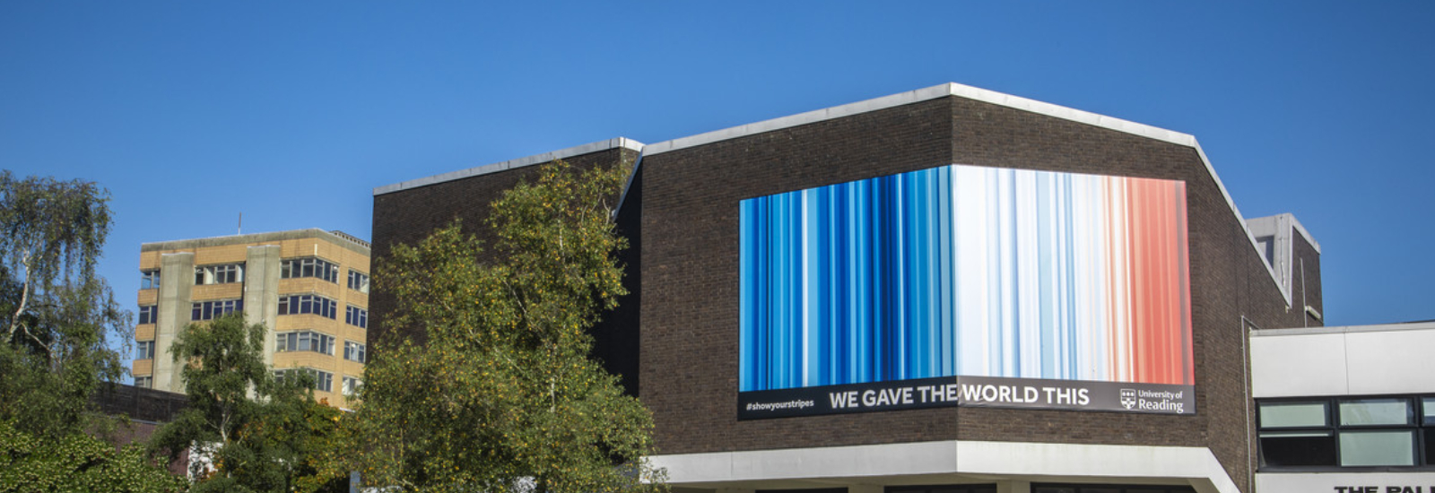
Searching for a way to share this climate data clearly and concisely, in 2018 he created a graphic illustrating the global average temperature for every year since 1850 in the form of a coloured band. The climate stripes – which use shades of blue to represent cooler years and red for warmer years – show a striking trend towards hotter temperatures in recent decades.
Downloaded more than a million times in its first week, Professor Hawkins’ creation has since featured on the front cover of prominent newspapers and magazines, made its debut on the main stage of Reading Festival, and adorned ties, a Tesla, a tram, and was most recently showcased as an eco-friendly clothing range at London Fashion Week.
Explaining the inspiration behind the infamous graphic, he told CONNECTED: “I was asked to participate in an event at the Hay Festival and speak to an audience that probably wasn’t used to seeing scientific graphs. I was looking for as simple a way as possible to communicate the fact that the world is warming up, so I designed a simple set of stripes to share that message.
“As soon as I put the colours on the screen and explained what they were you could see the pennies drop,” he explained.
“The most important thing we can do about climate change is talk about it. The more conversations we can start, the better, and I realised this concept was a novel starting point.”
Bringing a local angle to a global story has been key to ensuring the climate stripes have not faded from public consciousness – alongside a team of colleagues, Professor Hawkins compiled versions of the graphic for every country and made them available for download.
“Nobody experiences how global temperatures change directly; they experience the weather and climate where they live,” he explained. “Producing a graphic for every country allows people to talk about how things have changed in their own back yard.
“Rather than an abstract concept of a global temperature, the stripes relate to what they experience year-to-year.
“Having local versions that matter more to people has been important and a reason why the concept has spread so much.”
Ironically, Professor Hawkins believes the most important elements of his graphics are the ones that are missing – the stripes that follow the one last featured. “That is what we must always talk about,” he stressed.
“It’s our choices that determine what happens next; do the colours go even darker or do they stay at the levels they are now?”
Tackling climate change
In the lead-up to COP26, Professor Hawkins shares the work that he intends to communicate at the summit and what he hopes it will achieve.
He said: “We are taking an interactive visual exhibit of the climate stripes to COP26 to highlight the changes that have already occurred, the risks for the future, and to prompt conversations about the choices required now.
“The summit is going to be a vital platform to help accelerate actions to reduce emissions around the world. The consequences of our changing climate will continue to get worse until we reach global net-zero greenhouse gas emissions,” he concluded.
Discover more about Professor Hawkins’ research.