Adopting a flipped classroom approach to meet the challenges of large group lectures
Name/School/ Email address
Amanda Millmore / School of Law / a.millmore@reading.ac.uk
Overview
Faced with double-teaching a cohort of 480 students (plus an additional 30 in University of Reading Malaysia), I was concerned to ensure that students in each lecture group had a similar teaching experience. My solution was to “flip” some of the learning, by recording short video lectures covering content that I would otherwise have lectured live and to use the time freed up to slow the pace and instigate active learning within the lectures. Students provided overwhelmingly positive feedback in formal and informal module evaluations, the introduction of flipped learning has aided the welfare of students, allowing those who are absent or who have disabilities or language barriers to revisit material as and when needed. For staff, it has aided the reduction in my workload and has the ongoing benefit of reducing workload of colleagues who have taken over teaching the module.
Objectives
- Record short video lectures to supplement live lectures.
- Use the time freed up by the removal of content no longer delivered live to introduce active learning techniques within the lectures.
- Support the students in their problem-solving skills (tested in the end of year examination).
Context
The module “General Introduction to Law” is a “lecture only” first year undergraduate module, which is mandatory for many non-law students, covering unfamiliar legal concepts. Whilst I have previously tried to introduce some active learning into these lectures, I have struggled with time constraints due to the sheer volume of compulsory material to be covered.
Student feedback requested more support in tackling legal problem questions, I wanted to assist students and needed to free up some space within the lectures to do this and “flipping” some of the content by creating videos seemed to offer a solution.
As many academics (Berrett, 2012; Schaffzin, 2016) have noted, there is more to flipping than merely moving lectures online, it is about a change of pedagogical approach.
Implementation
I sought initial support from the TEL (Technology Enhanced Learning) team, who were very happy to give advice about technology options. I selected the free Screencast-O-Matic software, which was simple to use with minimal equipment (a headset with microphone plugged into my computer).
I recorded 8 short videos, which were screencasts of some of my lecture slides with my narration; 6 were traditional lecture content and 2 were problem solving advice and modelling an exemplar problem question and answer (which I had previously offered as straightforward read-only documents on Blackboard).
The software that I used restricted me to 15 minute videos, which worked well for maintaining student attention. My screencast videos were embedded within the Blackboard module and could also be viewed directly on the internet https://screencast-o-matic.com/u/iIMC/AmandaMillmoreGeneralIntroductiontoLaw.
I reminded students to watch the videos via email and during the lectures, and I was able to track the number of views of each video, which enabled me to prompt students if levels of viewing were lower than I expected.
By moving some of the content delivery online I was also able to incorporate more problem-solving tasks into the live lectures. I was able to slow the pace and to invite dialogue, often by using technology enhanced learning. For example, I devoted an hour to tackling an exam-style problem, with students actively working to solve the problem using the knowledge gained via the flipped learning videos and previous live lectures. I used the applications Mentimeter, Socrative and Kahoot to interact with the students, asking them multiple-choice questions, encouraging them to vote on questions and to create word clouds of their initial thoughts on tackling problem questions as we progressed.
Evaluation
I evaluated reaction to the module using the usual formal and informal module evaluations. I also tracked engagement with the videos and actively used these figures to prompt students if views were lower than expected. I monitored attendance to modules and didn’t notice any drop-off in attendance. Finally, I reviewed end of year results to assess impact on students results.
Impact
Student feedback, about the videos and problem solving, was overwhelmingly positive in both formal and informal module evaluations.
Videos can be of assistance if a student is absent, has a disability or wishes to revisit the material. Sankoff (2014) and Billings-Gagliardi and Mazor (2007) dismiss concerns about reduced student attendance due to online material, and this was borne out by my experience, with no noticeable drop-off in numbers attending lectures; I interpret this as a positive sign of student satisfaction. The videos worked to supplement the live lectures rather than replace them.
There is a clear, positive impact on my own workload and that of my colleagues. Whilst I am no longer teaching on this module, my successor has been able to use my videos again in her teaching, thereby reducing her own workload. I have also been able to re-use some of the videos in other modules.
Reflections
Whilst flipped learning is intensive to plan, create and execute, the ability to re-use the videos in multiple modules is a huge advantage; short videos are simple to re-record if, and when, updating is required.
My initial concern that students would not watch the videos was utterly misplaced. Each video has had in excess of 1200 views (and one video has exceeded 2500). Some of the material was only covered by the flipped learning videos, and still appeared within the examination; students who tackled those questions did equally well as those answering questions covering content which was given via live lecture, but those questions were less popular (2017/18 examination).
I was conscious that there may be some students who would just ignore the videos, thereby missing out on chunks of the syllabus, I tried to mitigate this by running quizzes during lectures on the recorded material, and offering banks of multiple choice questions (MCQs) on Blackboard for students to test their knowledge (aligned to the summative examination which included a multiple choice section). In addition, I clearly signposted the importance of the video recorded material by email, on the Blackboard page and orally and emphasised that it would form part of the final examination and could not be ignored.
My experience echoes that of Schaffzin’s study (2016) monitoring impact, which showed no statistical significance in law results having instituted flipped learning, although she felt that it was a more positive teaching method. Examination results for the module in the end of year summative assessment (100% examination) were broadly consistent with the results in previous academic years, but student satisfaction was higher, with positive feedback about the use of videos and active learning activities.
Follow Up
Since creating the flipped learning videos another colleague has taken over as convenor and continued to use the videos I created. Some of the videos have also been able to be used in other modules. I have used screencast videos in another non-law module, and also used them as introductory material for a large core Part 1 Law module. Student feedback in module evaluations praised the additional material. One evolution in another module was that when I ran out of time to cover working through a past exam question within a lecture, I created a quick screencast which finished off the topic for students; I felt that it was better to go at a more sensible pace in the lecture and use the screencast rather than rush through the material.
Michelle Johnson, Module Convenor 2018-2019 commented that:
“I have continued to use and expand the flipped learning initiative as part of the module and have incorporated further screencasts into the module in relation to the contract law content delivered. This allowed for additional time on the module to conduct a peer-assessment exercise focussed on increasing the students’ direct familiarity with exam questions and also crucially the marking criteria that would be used to score their Summer exams. Students continue to be very positive about the incorporation of flipped learning material on the module and I feel strongly that it allowed the students to review the more basic introductory content prior to lectures, this allowing time for a deeper engagement with the more challenging aspects of the lectures during lecture time. This seemed to improve students understanding of the topics more broadly, allowing them to revisit material whenever they needed and in a more targeted way than a simple lecture recording.”
TEF
TQ1, LE1, SO3
Links
University of Reading TEL advice about personal capture – https://sites.reading.ac.uk/tel-support/category/learning-capture/personal-capture
Berrett, D. (2012). How “Flipping” the Classroom Can Improve the Traditional Lecture. – https://www.chronicle.com/article/how-flipping-the-classroom/130857. Chronicle of Higher Education..
Billings-Gagliardi, S and Mazor, K. (2007) Student decisions about lecture attendance: do electronic course materials matter?. Academic Medicine: Journal of the Association of American Medical Colleges, 82(10), S73-S76.
Sankoff, P. (2014) Taking the Instruction of Law outside the Lecture Hall: How the Flipped Classroom Can Make Learning More Productive and Enjoyable (for Professors and Students), 51, Alberta Law Review, pp.891-906.
Schaffzin, K. (2016) Learning Outcomes in a Flipped Classroom: A comparison of Civil Procedure II Test Scores between Students in a Traditional Class and a Flipped Class, University of Memphis Law Review, 46, pp. 661.

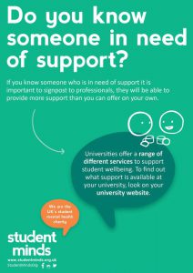
 Student Minds is the UK’s Student Mental Health Charity, and was RUSU’s charity of the year for 2018/19. Student Mind’s aspiration is to ensure students have the skills, knowledge and confidence to talk about their own mental health and look out for their peers. To this end they provide research-driven training and supervision to university staff to enable students to be equipped to bring about positive change on their campuses through peer support.
 The objectives are: